After analysing Prime Video's competitors, we decided to conduct a heuristic evaluation to review the current user interface and identify possible user experience problems other than the ones pointed on user reviews for the platform. At this stage we decided to evaluate the interface according to Nielsen’s Heuristics.
#1. Visibility of system status: indicators such as genres and subgenres show users where they currently are (category).

#2. Match between system and the real world: the interface is clear and uses words most streaming users can understand. Content follows a fairly natural order on the home page.
#3 User control and freedom: the most common user actions, such as clicking the wrong thing, pressing play by mistake, adding to the list, etc. can be easily undone.
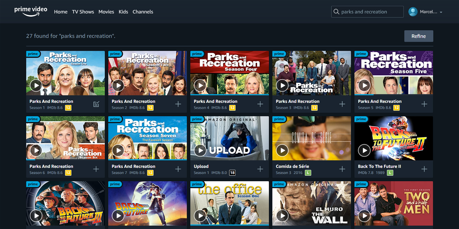
#4. Consistency and standards: the home page and general menus follow industry conventions, however, when searching or exploring a TV show with many seasons, the seasons are shown as separate items of the catalogue rather than subitems inside that TV show.
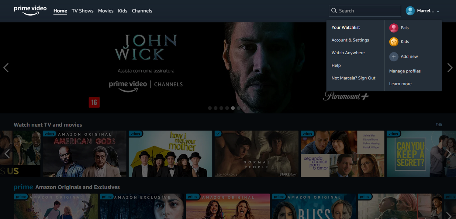
The watchlist menu can only be accessed on the drop-down menu at top right, which is more focused on technical settings. This should be on the main menu.
#5. Error prevention: if the user wants to access account settings, login details are required again to improve safety. On Search, if there are any spelling mistakes, the system still finds relevant related content close to that term.
#6. Recognition rather than recall: relevant menu items are always visible to the user during navigation.
#7. Flexibility and efficiency of use: on PC, Prime Video features some keyboard shortcuts to toggle play/pause, enter or exit full screen, rewind, fast-forward, volume controls, etc.
#8. Aesthetic and minimalist design: the interface is minimalistic with no unnecessary information or clutter.
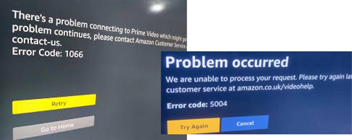
#9. Help users recognize, diagnose, and recover from errors: many error messages are unclear and show internal error codes, which the user then needs to look for in the Help Centre to solve.
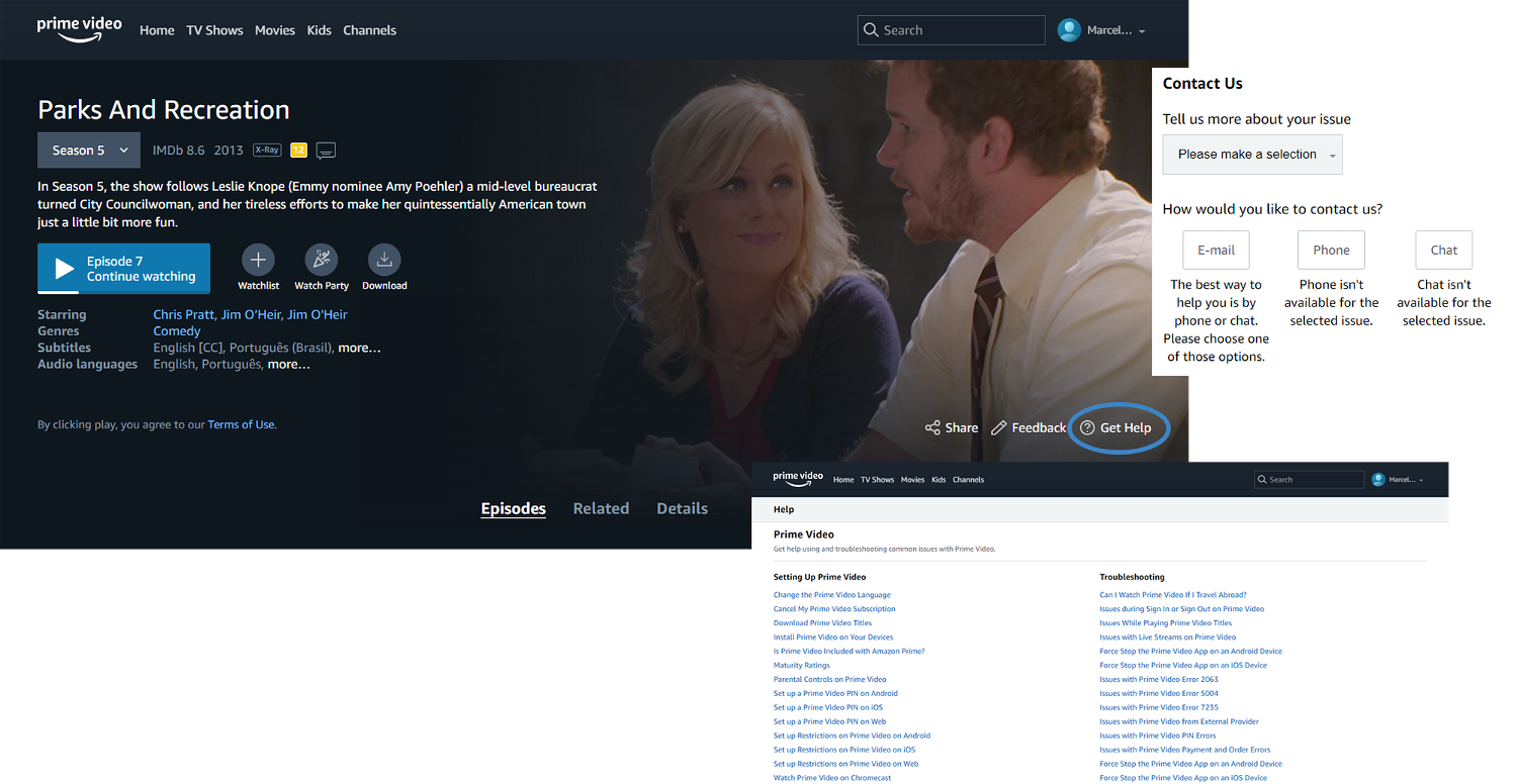
#10. Help and documentation: a 'get help' button is available inside each content, as well as a 'Help' link at the bottom of the Home Page. The Help Centre is comprehensive and allows users to contact Support.