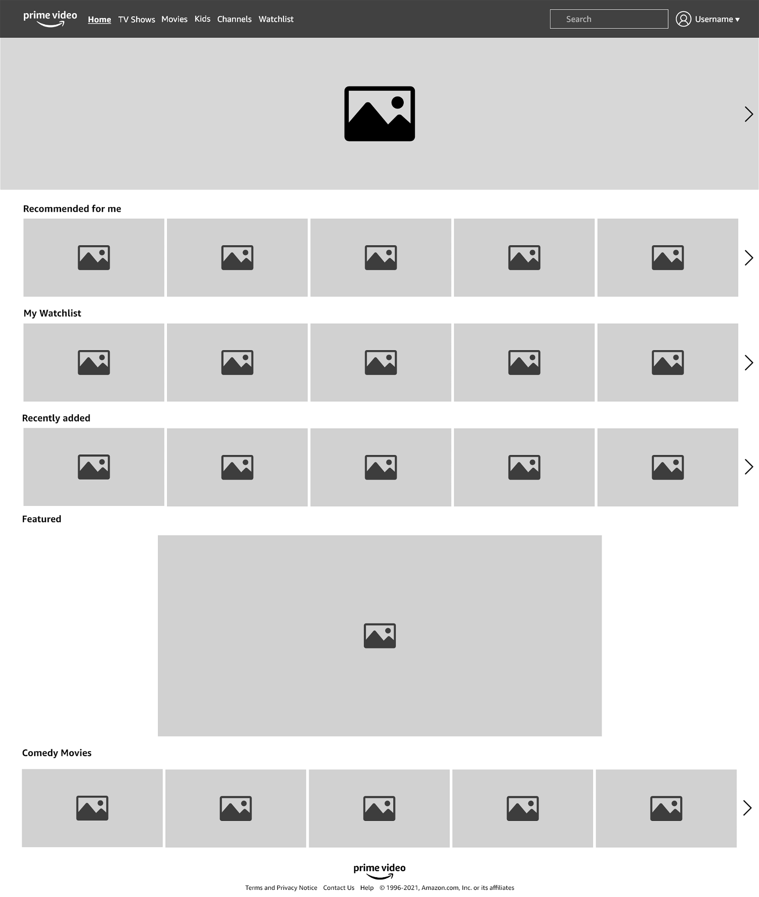
Main page
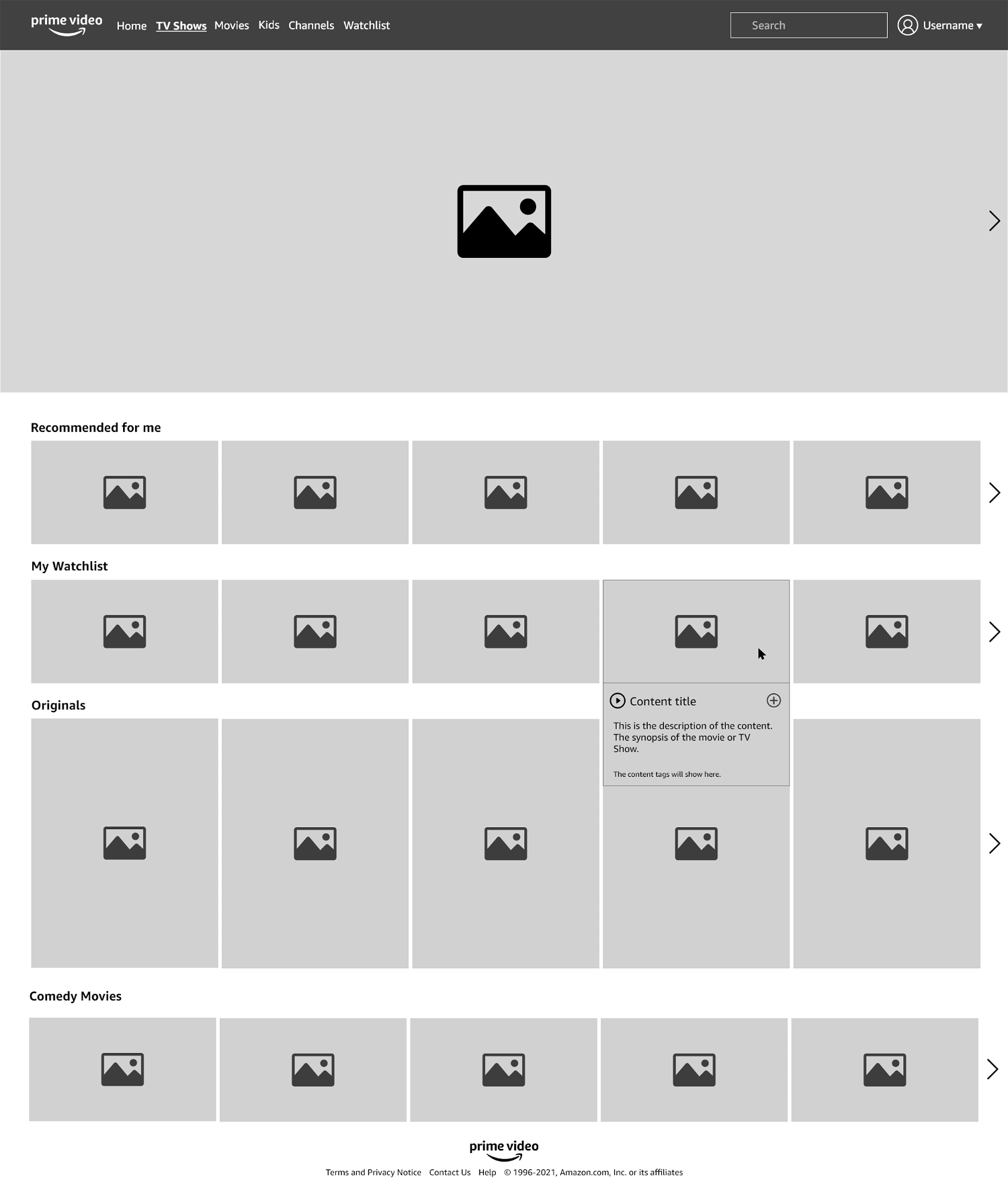
Category page
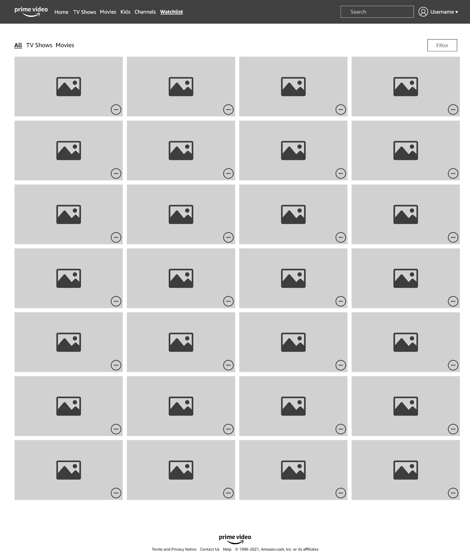
Watchlist page
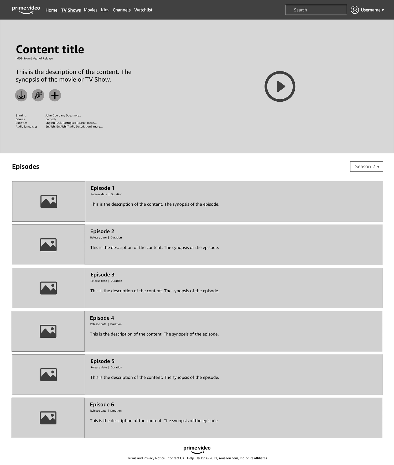
Content page
From these wireframes we built a prototype and did a new round of usability tests to gather more insight. This time, some of the observations included:
- Users liked the navigation of the main page and categories page and that the first lists are personalised to their preferences;
- They liked the Search page and that results are more relevant both to the search term and their preferences and watch history. However, they would like a way to filter results that is more prominent and clear, similar to the Watchlist page;
- In the category page, they were drawn to the original content list, but didn't feel it was obtrusive as some said about the current Prime Video interface;
- Users said that TV shows showing in search as one item with the seasons as "subitems" make much more sense than each season as a separate item;
- Users found the Watchlist much faster and easier on the prototype;
- Some users said they would like the Search result page to show more straightforward results;
- In the content page, they said the position of some items (such as the selector for the seasons of a show) made more sense on the prototype, but they expected it to be closer to the subtitle ('episodes').
From the wireframes and prototype we will work on the visual interface design to refine ideas and take new observations into consideration.