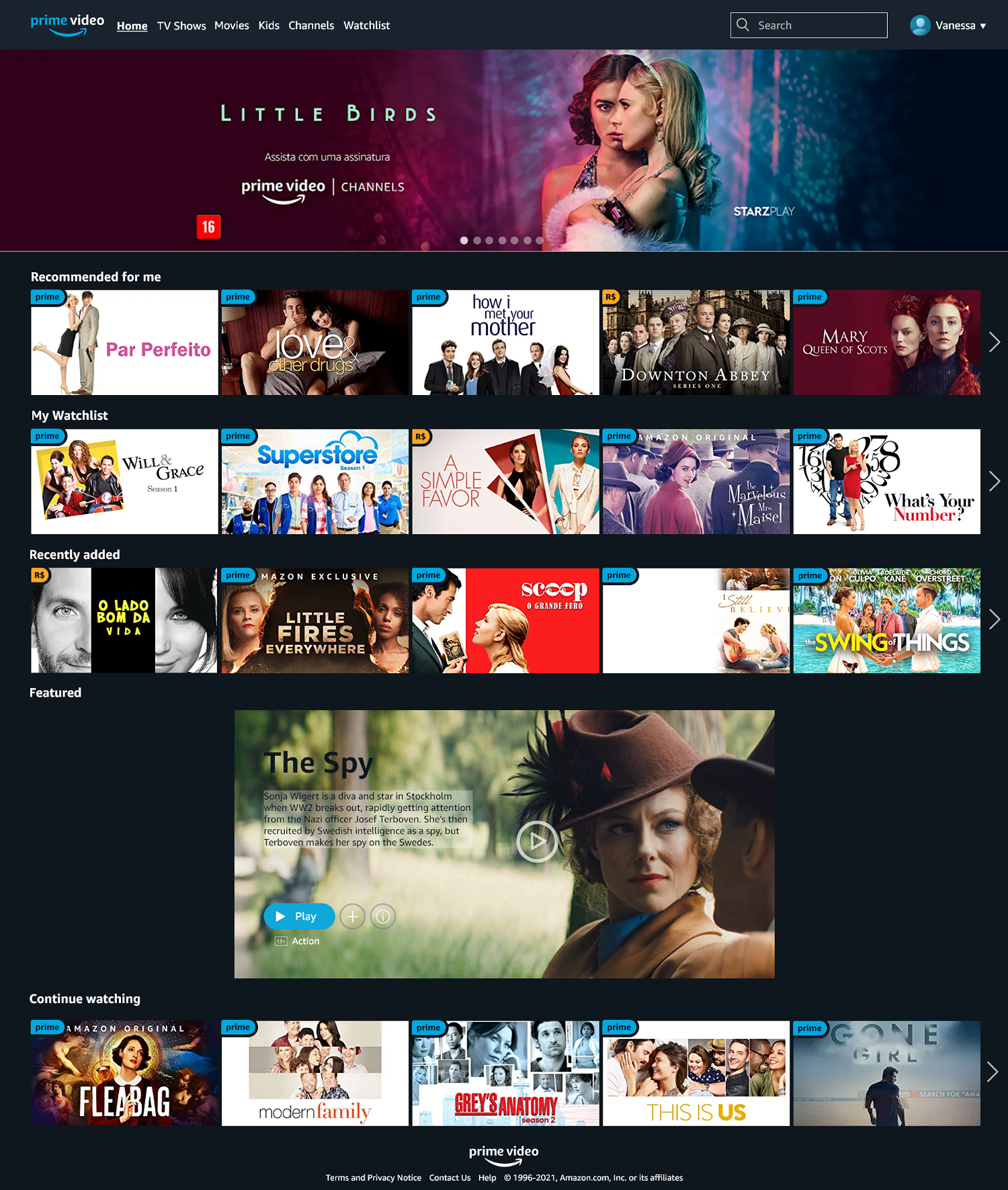
Main page
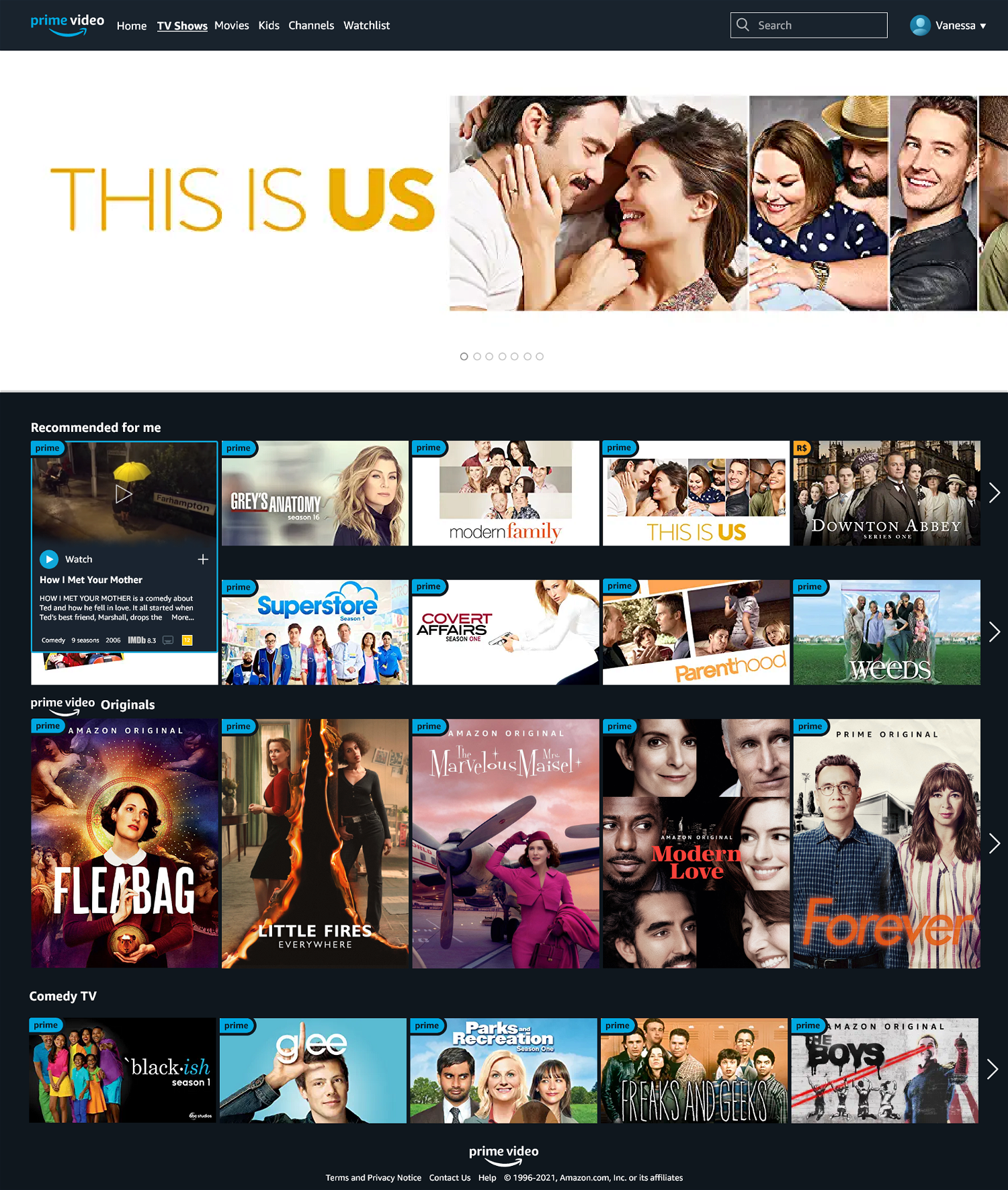
Category page with content preview
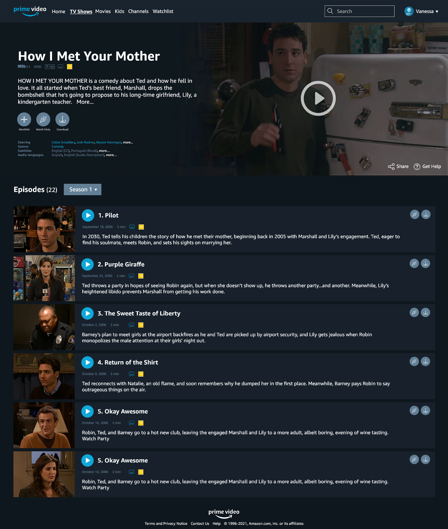
Content page
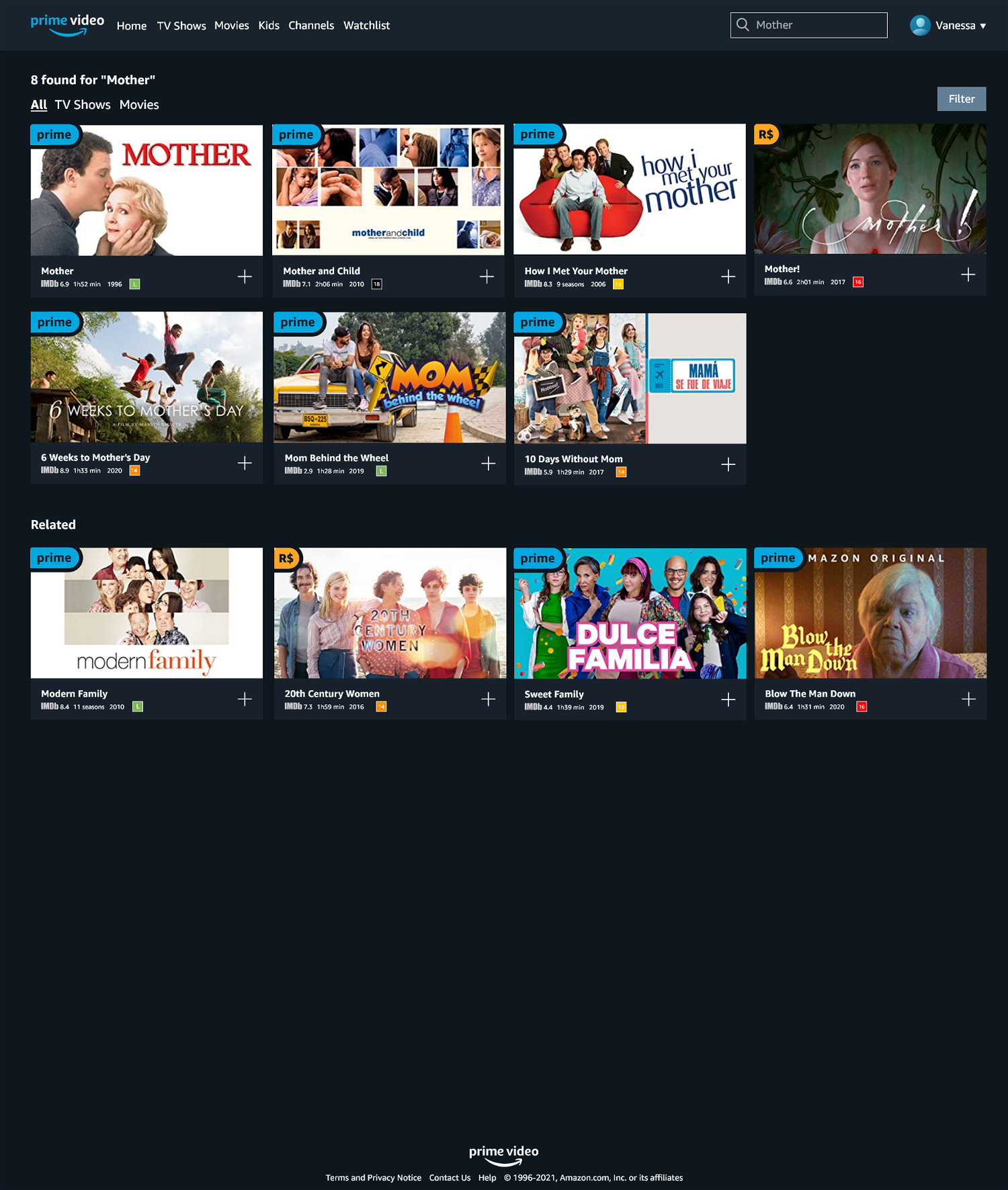
Search results page
Overall, we changed few visual aspects and focused more on information architecture, categories, search results, filters and personalisation, etc as these were bigger issues according to primary and secondary research. The proposed changes were:
- Categories more tailored to the user (in this case, the persona);
- Highlight of featured content is also more personalised and shows more information;
- A 'continue watching' category, as many users complained about the lack of one;
- Bigger focus on original content in an unobtrusive and personalised way;
- The Watchlist menu is on a more prominent and easier to find location;
- Category page has a bigger space for highlighted content to draw more attention and interaction, including for relevant original content;
- More consistency, e.g. all items show a preview on hover with video, IMDB score and other relevant information; the same icons are used throughout the pages and menus; etc;
- Seasons of a TV show are listed within the show, not as separate items;
- Some items on the content page, such as the selector for the seasons of a TV show, were reorganised for better flow;
- Search results show items directly related to the search term first and then related items;
- Search results and watchlist pages have an easier and clearer way of filtering content.